

CLIENT
Puppet
SKILLS
Research, Design
PDS typography refinements
Puppet Design System (PDS) is a collection of the common values, behaviors, components, and styles we share at Puppet. The current typography used in Puppet Design System had served us well over the last few years but there are areas where it could be improved. This work set out to identify those issues, offer potential solutions and identify a path for implementation.

01. Analysis of the current type system to identify issues
The following gives a breakdown of some of the issues with our current type system and how we can resolve them:
Paragraph and line heights
Currently there’s inconsistent paragraph and line height spacing of the different typographic elements on the page which causes confusion for the user.

Vertical grid
We use a vertical grid of 4px but the current line heights and paragraph spacing break this.

Header range
Because it uses a different font, h5 is almost the size of h4. h6 also uses Open Sans and is sometimes smaller than the body copy following it. Having only one option between the 32 pt size of h2 and the 18 pt size of h4 is also limiting.

Body copy
Our Body copy can appear small and compact when used on websites and areas with more screen real estate or alongside bigger headers.

Multiple styles = multiple files
When picking typefaces for a type system, every font style that’s used (bold, regular, italic etc.) requires a separate file which increases latency and page loading times. Furthermore, new style variations require manual additions to the library.
Pixel font sizes
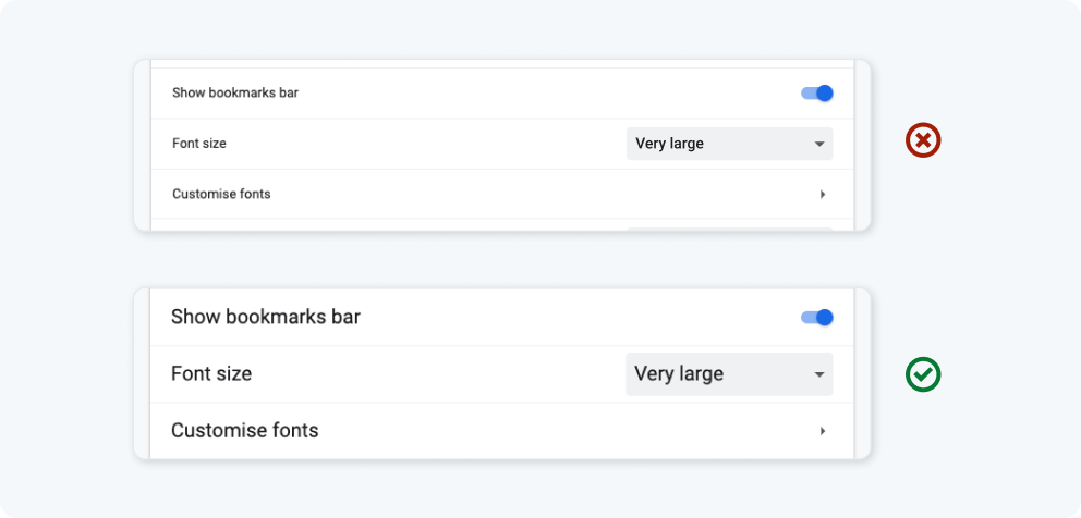
As designers, we’re used to thinking about type sizes in pixels and design packages still force this behaviour but specifying fixed pixel sizes isn’t ideal as user changes to their default browser font size, will be ignored.
02. Requirements
Based on the analysis, I set out the following requirements for the task:
- Experiment with alternative new typeface combinations
- Explore variable fonts and how they might help reduce complexity
- Revise all heading sizes so that there is a better sequence in the range
- Improve line height and paragraph spacing
- Create rules on spacing before and after heading and body content
- Create more size options for Body text to make it more versatile
- Make sure that line and paragraph heights are a multiple of 4px
- Investigate using REM sizes in our type system.
03. Exploring typefaces
I felt that we needed to explore new typeface combinations because some of the issues identified related to our current pairing. While styling was certainly important, it’s wasn’t the primary reason for this exercise so my main goals were to find a pairing that was legible and readable and worked well together.
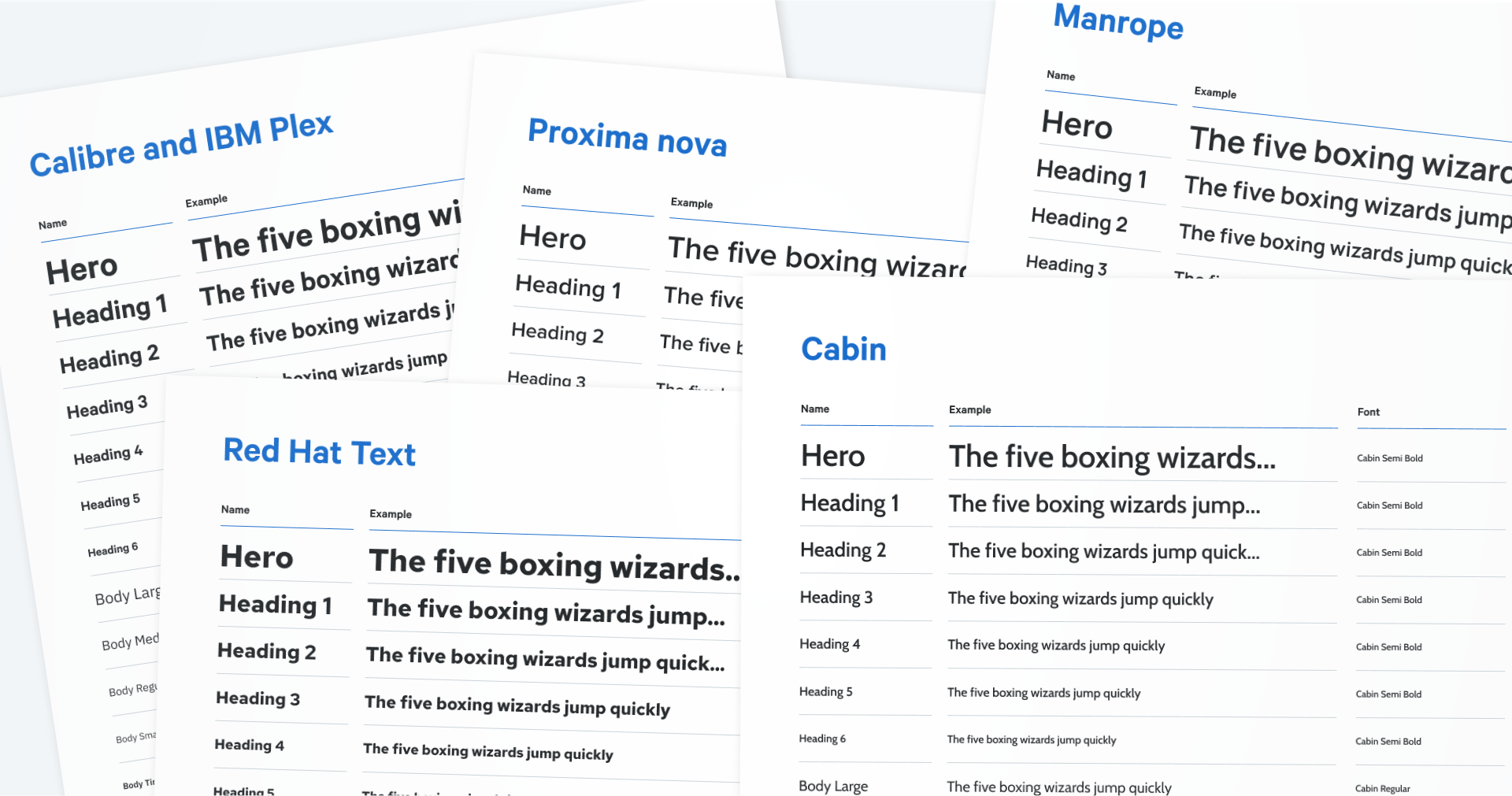
After much experiment, Inter was chosen as the most suitable replacement for both our Calibre and Opens Sans typefaces. The main reasons were:
- It's open source
- Available on Google Fonts
- A variable typeface
- A close match for both our current fonts
- Versatile as a single family
- It looks really good!
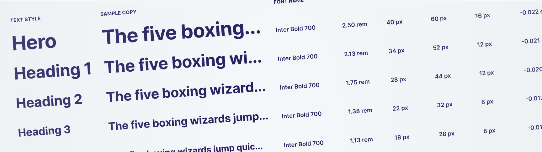
04. Calculating sizes
A number of the issues I identified related to sizing so after some research, I created rules that would bring some order to how we handle this. I then created a spreadsheet based on that rationale.
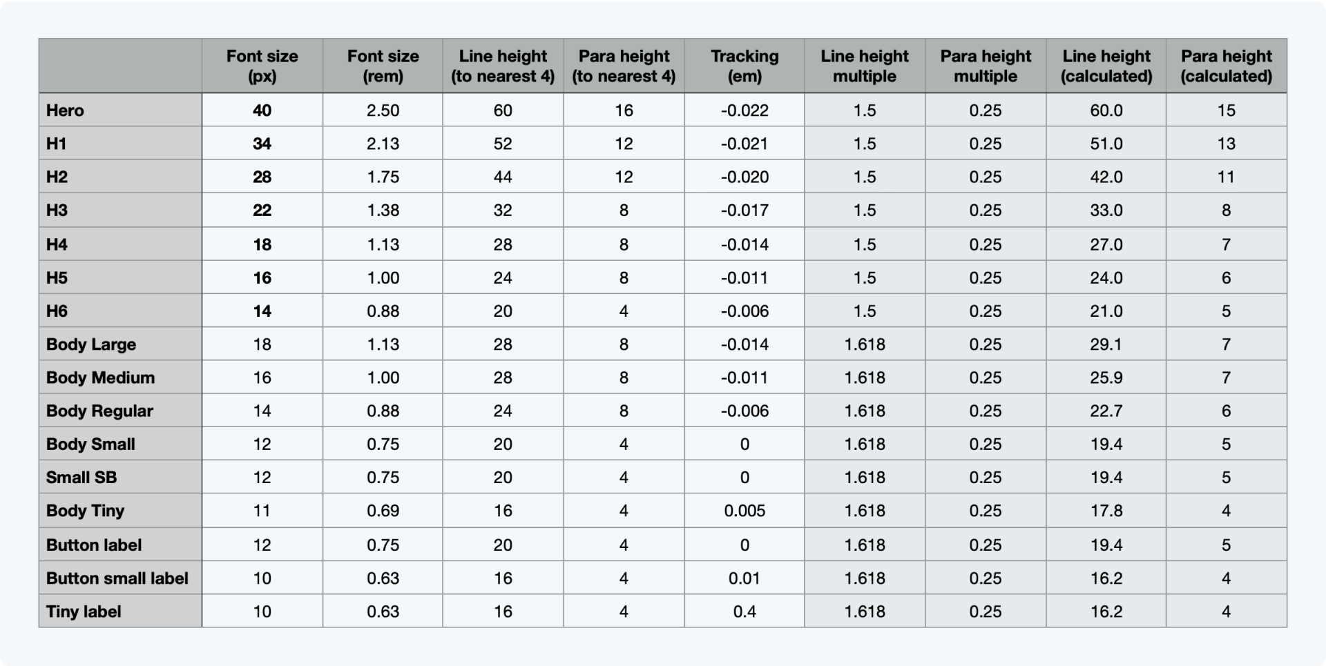
Specifying rem sizes
Font pixel sizes can be used in design with rems used in development. 1rem = 16px.
Horizontal grid
Line height must be a multiple of 4 to fit text into the horizontal grid.
Body text
Body text is split into 4 new sizes - Body Large, Body Medium, Body Regular and Body Small.
Line height
The ratio between line height and header font size is 1.5. The ratio between line height and body font size is 1.618 (Golden ratio). The text size should be rounded to the nearest nearest 4px.
Paragraph height
Paragraph spacing should be 1.25 times line height, rounded to the next nearest 4px. (In Figma we minus the line-height from this figure so 0.25 is specified)
05. The result
Combining the new typeface with the calculations:

06. Example usage
Making sure the type calculations work is important but it’s also important to working out a system for how they interact with each other. This can evolve to be more complex but intitially the following structure was proposed:

07. Comparison of old vs new
Any change to the typography that we use had the potential to cause issues for the user - the more extreme those changes, the more severe the issues might be. As demonstrated in the comparisons here, the changes are pretty subtle. To the naked eye, the user will likely not notice the individual typographic changes but with the improvements to accessibility, readabilty and legibility, they hopefully should notice an improvement to the overall user experience.


08. Conclusion
The final step of the process was to get buy in for the proposed changes from the different stakeholders so I presented this work to the UX, design system, engineering and product marketing teams. The benefits were plentiful and the downsides limited so it was well received.
Any change to the typography that we use had the potential to cause issues for the user - the more extreme those changes, the more severe the issues might be. As demonstrated in the comparisons above, the changes are pretty subtle. To the naked eye, the user will likely not notice the individual typographic changes but with the improvements to page load speed, readabilty and legibility, they hopefully should notice an improvement to the overall user experience.

Get in touch
Phone
© John Murray 2024
